Make your website search bar work harder for your visitors
10/7/2025 · 3 minute read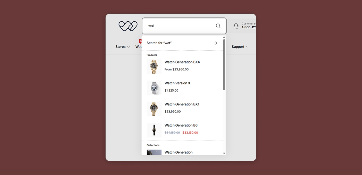
A lot of online stores overlook one simple thing that shapes how people find what they want - the search bar.
It’s one of those features you expect to just be there, but it’s surprising how many sites make it hard to spot or awkward to use.
Let’s imagine this: a visitor lands on your store looking for something specific.
They scan the header area, see a wide navigation menu stretching across the screen, and a tiny magnifying glass icon tucked in a corner.
If they miss it, they’ll start guessing which collection holds the item they want, and what the right path using the main navigation is.
Now they’re thinking, scrolling, clicking. Every second adds friction, and friction kills conversions.
Why people skip using search
It’s easy to assume visitors who need something will naturally use your search bar. But in reality, they often don’t - for several reasons:
There’s no search bar at all. Some sites, especially custom-built ones, simply don’t include it.
It’s too small or hidden. A tiny icon doesn’t stand out, especially on mobile.
They think browsing will be faster. People often try to find categories before typing.
Past bad experiences. Many users have used clunky mobile search inputs before.
They don’t trust the results. Poor search accuracy trains users not to bother.

If you’re managing an e-commerce store with dozens or even hundreds of collections, this becomes a serious problem. Every extra step a shopper takes to locate a product reduces their chance of buying it.
Why your search design matters
Think about how people shop on Amazon. It’s basically impossible to find anything there without search. The entire experience revolves around it. Their search bar is large, always visible, and right at the top of every page. That’s not an accident - it’s design driven by user behavior.
Smaller e-commerce stores can learn from that approach. Here are a few design considerations that make a big difference:
Keep the search bar always visible. Don’t hide it behind an icon.
Make it wide and obvious. People should notice it instantly, without hunting for it.
Use clear labeling. The placeholder text (“Search products...”) should guide users.
Optimize for mobile. The input should be easy to tap, with autocomplete or recent searches to reduce effort.

How to analyze your search performance
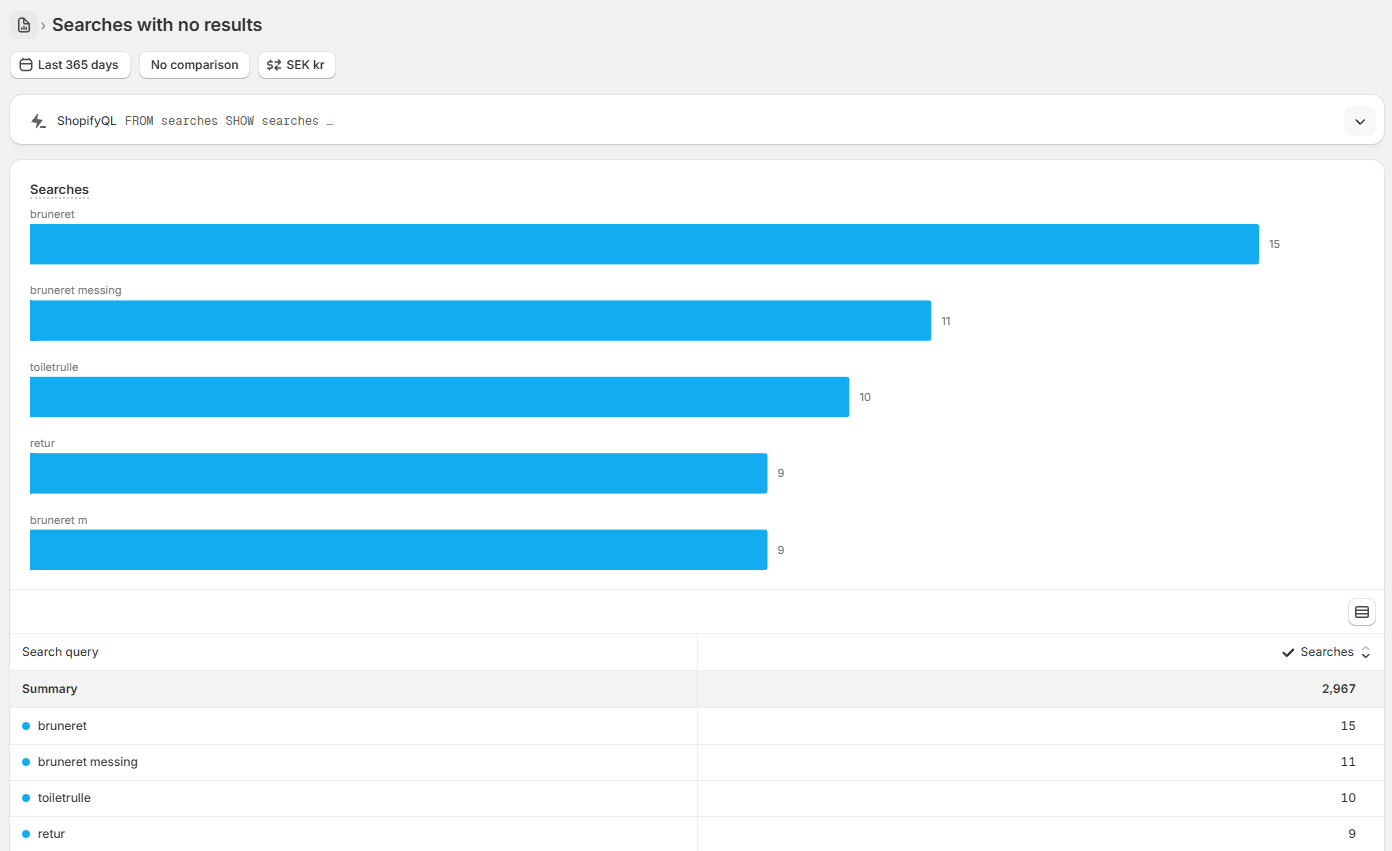
Before redesigning, look at the data you already have. Tools like Google Analytics or built-in site search reports can tell you how many visitors actually use your search bar.
Here’s what to look for:
Search usage rate. What percentage of total sessions include a search?
Conversion rate from search users. Searchers often convert higher if they find what they want quickly.
Exit rate after search. If many people leave after searching, results may be poor or irrelevant.
If the usage rate is low, that doesn’t always mean visitors don’t need it. It might mean they can’t find it. Try A/B testing a larger or more prominent search bar to see if engagement increases.
If the rate is high, focus on improving accuracy and load time. Search that works well can become one of your strongest conversion tools.
Common questions about website search
1. What’s a good search usage rate for an online store? There’s no universal number, but 10–20% of sessions with a search is common. Higher rates may indicate people can’t find things through navigation alone.
2. Should I show recent or suggested searches? Yes. They reduce typing effort and help users discover what’s popular or trending. They also help when no results are returned, instead of just showing an error.
3. What if I only sell a few products? If your product range is small, search might not be critical. But even then, it can help repeat customers find specific items quickly.
4. How do I test if search is too hidden? Ask a few people unfamiliar with your site to find a specific product. Time how long it takes them. If they hesitate or scroll around, your search needs work.
5. Does adding voice search help? It can, especially on mobile, but it’s not essential for every site. Focus first on making text search intuitive and visible.
Bringing it all together
The search bar is one of the simplest, most overlooked parts of web design. When done right, it quietly improves usability, reduces friction, and increases conversions. When ignored, it can frustrate visitors and drive them away.
Spend time observing how people use your site. Check your analytics. Then, make small, measurable improvements. You don't have to add large-scale functionality like AI-assisted search from the start. Sometimes, just making the search bar a little bigger is all it takes to make your site easier - and faster - to use.
