Guide to increase your Shopify Speed Score: Advanced level
3/11/2022 · 28 minute read
If you’re a Shopify store owner, you’ve probably come across the speed score metric.
You might also be familiar with the connection between your website’s speed and KPIs like conversions, or metrics of user experience.
If you’ve ever wondered what the score is, where it comes from, what is a good average Shopify speed score, and how to improve it, you’re in the right place.
Here, you’ll learn about its importance to your business. You’ll find out how it works under the hood. And I’ll give you actionable steps to apply, so you can improve it right now. Improvements that the fastest and most modern websites in the world use, to achieve top performance.
First, a detailed examination of this metric.
Everything you need to know about the Shopify Speed Score
Let’s get familiar with the inner workings of this score.
If you want to get right to the actual steps to increase it, you can skip this section.
What is the Shopify speed score?
To put it simply, it’s a score that measures how fast your Shopify store is.
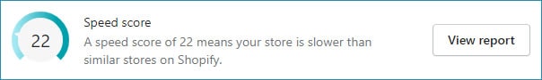
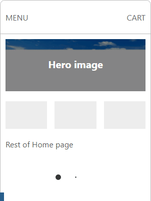
If you go to the Themes page on the admin dashboard, you’ll see an Online store speed section. There is an indication with a number, ranging from 1 to 100.
There’s also a text that gives you an idea of how your website compares to similar stores.
How is the Shopify speed score calculated?
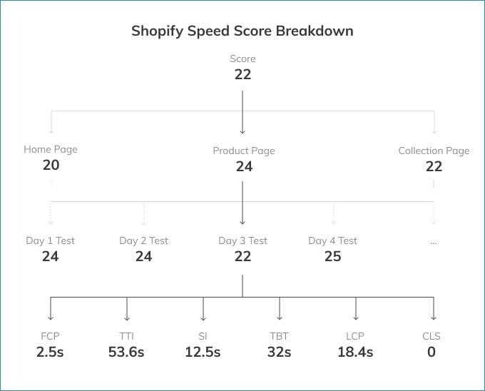
The Shopify Speed Score is an average of the scores of three pages:
Home page
Product page (with the most traffic in the past 7 days)
Collection page (with the most traffic in the past 7 days)
The score of each page is its Lighthouse score, averaged out over several days.
Lighthouse is a tool by Google to measure the speed and user experience (UX) of a website.
But how is a page’s score calculated?
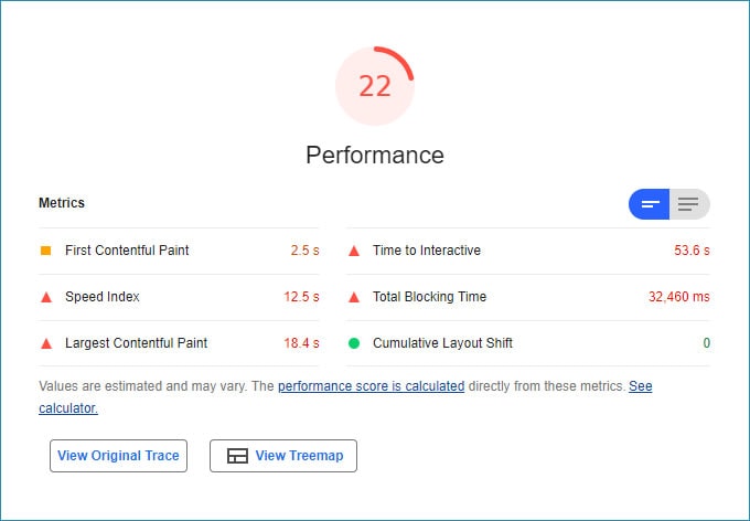
There are six different metrics that this tool measures. The score is the weighted average of them.
The six metrics are calculated on mobile, and they are:
FCP (First Contentful Paint)
SI (Speed Index)
LCP (Largest Contentful Paint)
TTI (Time to Interactive)
TBT (Total Blocking Time)
CLS (Cumulative Layout Shift)
The first five are measured in time, and CLS is measured based on the screen surface (more on this in a bit).
A few things to note.
First, the test is performed by Shopify, in an environment common to all Shopify stores. This increases reliability.
Second, the test is performed once a day.
Third, there are factors that might cause the results to fluctuate. Don’t always take it as 100% accurate.
To recap, your Shopify speed score is an average of the Home, Product and Collection pages. Their scores are coming from the average score of Lighthouse tests for the past few days. These tests measure six different aspects of speed and user experience.
To better understand the score’s factors and how Lighthouse weights them, here is the calculator.
Let’s look at these metrics one at a time.
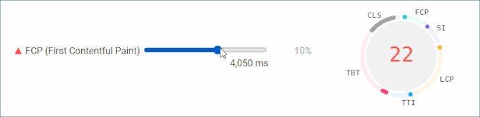
What is the FCP?
The FCP (First Contentful Paint) is the time it takes for the first visible element to appear on the user’s screen, from the moment the page starts loading.
The element can be a text, a container, an image. A lot of times it’s your page’s header.
To get a bit more technical:
When a browser visits your page, it requests the page from Shopify’s servers. It downloads the page as a text document, and starts to read its contents and paint them on the screen. In the beginning of the document ( head ), there’s a lot of information regarding the page. There are also links with resources that your browser must download before it proceeds with painting the page on your screen. At some point, the browser reaches the main, visible part of the document (body). At this point it starts to display the elements defined in the body, on the screen. And the header is usually shown first (with your navigation etc.).
So we can tell that one thing that delays the FCP, is the part of the document that comes before the first part of the body .
See how improving it affects the Lighthouse score:
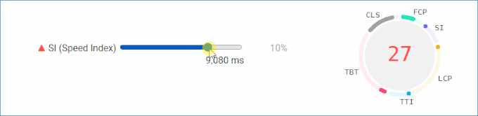
What is the SI?
The SI (Speed Index) is a bit more complicated to measure.
Lighthouse captures a video of the page as it loads, until it is fully loaded. It figures out when exactly the page has “settled”, and sets this point in time as the “Speed Index” time.
Since it’s more of a visible outcome of other aspects of speed, anything that “delays” page load, usually increases the SI.
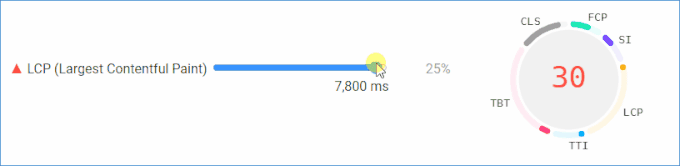
What is the LCP?
The LCP (Largest Contentful Paint) is like the FCP, but for the largest element, instead of the first element.
This element is above-the-fold. It’s immediately visible on your screen, instead of further down the page.
Lighthouse can determine which one it is, during page load. And it measures how much time it takes, before it is properly displayed. This means that, e.g. if it’s an image, it needs to be fully loaded and visible.
In most Shopify home pages, the hero or slider image is the largest paint. On product pages, it’s the featured image of the product. Collections can vary, but it’s usually one of the product images displayed on the list.
To improve the LCP, we usually apply techniques to display the main image as soon as possible. If it’s a text, we use different techniques to make its size and font “settle” quickly.
Ideally, the LCP should be close to the FCP. And improving the FCP should also improve the LCP.
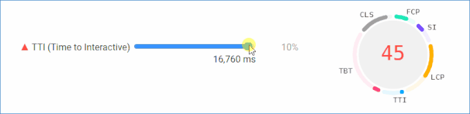
What is the TTI?
Generally, the TTI (Time to Interactive) is the time it takes for whatever you see on your screen when a page loads, to be interactive (for the most part). Meaning, the user can perform actions, mostly click on things.
This is determined by a few things.
One aspect is how fast the page can display actual content (e.g. text and buttons), otherwise there is nothing to be interactive.
Another aspect is how quickly the page’s scripts (JavaScript) have been executed, to make most of the page interactive.
To improve this metric, we improve things like the FCP so we can quickly show content on the screen (e.g. the hero section with an action button). We also optimize the theme’s and apps’ scripts.
This metric is one of the toughest to improve on Shopify stores.
This is because the apps you have installed load lots of JavaScript. Imagine having 10 apps that load on the homepage. And you can’t easily know what is a problem and what isn’t. Plus, you have almost no control over these scripts, and they way they delay interaction with important elements, like buttons and links.
So it takes a lot of optimization to make sure that the most critical scripts are executed quickly. By critical, I mean the scripts that are necessary to make the above-the-fold page interactive.
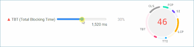
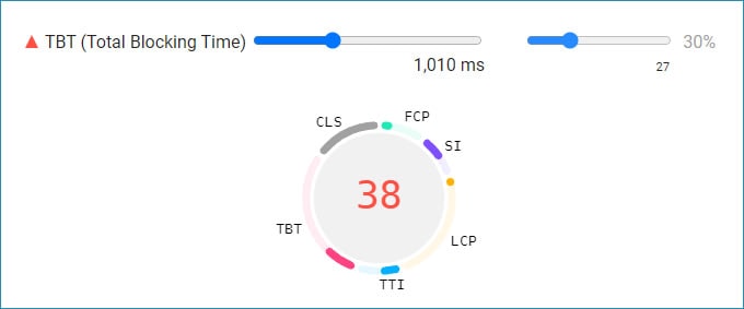
What is the TBT?
As the page loads, the browser keeps the device’s CPU busy with reading and executing code. Every time it has to do that, we call it a task. When the task takes a long time to finish, it will block and delay the processing of user input. For example, a user will have trouble scrolling down.
The TBT (Total Blocking Time) is referring to tasks that are longer than 50ms. It is the sum of the time it takes to execute all of them during page load.
As with the TTI, this metric is heavily affected by apps’ JavaScript assets.
It’s one of the biggest challenges in speed score improvement, even though it is the biggest factor to the Shopify speed score (30%).
One simple way of improving it is to remove apps you don’t need.
Ideally, your site’s assets have to be optimized so the tasks are split and kept as short as possible, below 50ms.
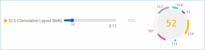
What is the CLS?
While a page is loading, some elements might shift in size and position. Styles and fonts are applied to text, and images are downloaded and displayed.
The sum of all these distances that the elements of the page move around (usually down), is the CLS (Cumulative Layout Shift).
You’ve probably experienced this. A page loads, you try to click a button, and suddenly everything changes places.
Most of the time, Shopify stores experience a large CLS because of:
Logos and navigation menus changing the header height
Product image sliders changing their height as the main image is displayed
Text that its properties change during load, causing it to span over less or more lines compared to its initial state.
We use HTML and CSS properties in the theme, to prevent layout shifts from happening above-the-fold.
What is the Shopify platform doing when it comes to Lighthouse score?
Shopify, as a platform, includes all kinds of optimizations so your store can be as fast as possible.
Here is a list of some of these, and their importance.
1. Shopify is using a CDN (Content Delivery Network), run by Fastly and Cloudflare. This means that your store’s static assets (images, fonts, most CSS and JavaScript files) are delivered to each device from a server near the visitor’s location. This improves most aspects of the performance score.
2. For files dynamically generated (e.g. the product page), they use server caching. This also allows for a faster response when the browser requests a page, and improves the performance score.
3. Their themes are already optimized. They use preloading, lazy loading, responsive images, CSS and JS bundling and minification, proper HTML syntax to avoid CLS, among others.
4. Their CDN serves your images in the WebP format, on most browsers. It’s a format more performant than traditional ones, since images are smaller in size.
5. Their servers instruct browsers to cache files that they download. So the next time a user visits a page, the browser doesn’t need to download the same file again, e.g. an image. This does not affect the Shopify speed score as much, since this is measured with a clean browser cache.
What is a good average Shopify speed score?
Here’s the real answer.
A good Shopify speed score, is one that increases conversions by an amount that justifies the investment to improve it.
Let’s say your store has a score of 80. You had to spend $4,800 to achieve it. Plus you pay monthly fees of $50 for optimization apps. Plus you removed an app that brings in a monthly profit of $300. So for the first year, we’re talking about a monthly cost of $750.
Did increasing the score reduce your bounce rate that much? So that it’s now bringing you extra profit of at least $750?
If so, it’s a good investment.
Also, here’s another reason why the answer is not that simple.
If your score is 50, and there’s an enormous, frustrating CLS on every page, is it a good score?
Or, a score of 50 might mean that your site keeps loading too much JavaScript in the background, even though the user quickly sees what they actually need to see.
Is it the same as a 50 that’s made up of a slow first interaction, even though the page doesn’t load any JavaScript after that?
The point is, there is no single answer.
However:
I understand that you might want a single number to work with.
In my experience, a score of 40 could provide a very good user experience. Even a 30, on some occasions.
And don’t try to achieve a 90 or 100. There are apps that are so useful, that it’s not worth it to exclude them or replace them with custom code, for the sake of chasing these numbers.
How are Shopify stores doing when it comes to the average Shopify speed score?
A good way to tell how other stores are doing, is trust the explanation under the speed score indication.
Shopify determines which stores are similar to yours, using several factors. Number of sales, gross sales, number and type of products and variants, traffic, apps, theme, etc.
Then, it tells you how you are doing compared to them.

Typically, only one out of ten Shopify stores is expected to score higher than 40. A lot fall between 20-25.
And because you might want to see what a store with a good score looks like, here are two examples:
(These sites were tested at the time of writing, and might have changed since then.)
1. Fangamer
Fangamer has a PSI score of about 40-50 on the homepage. That’s way above average.
(PageSpeed Insights – PSI – is Google’s online audit tool that uses Lighthouse.)
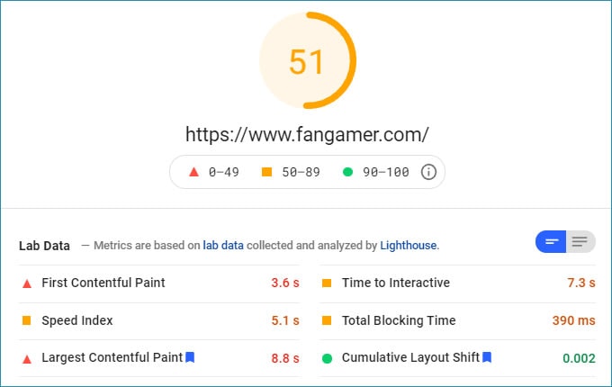
The first thing you will notice is its stability as the home page is loading.
Nothing moving around, text is quickly visible, images load flawlessly at their own pace. And once the page’s first content loads, you don’t get a feeling that there’s more stuff processing and delaying things.
The key to its good score is the TBT. It’s below 400ms.
In fact, take a look at what kind of score we’d be talking about, if it weren’t so low.
How was this achieved?
Well, it requests 12 JavaScript files, when other stores would easily need 50.
And only the theme’s JavaScript file is blocking page load. This proves how much of a difference it makes when you don’t fill the store with tons of third party apps.
2. Beardbrand
This store’s PSI score is about 45 on the home page.
You can see the way they achieve this:
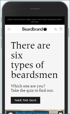
If you haven’t guessed already, it’s the lack of a hero image. There’s just a large title, and it is the LCP of the home page.
The impact it has on the score becomes obvious when you look at the product page’s LCP instead. It’s 7.8s, compared to 3.2s of the Home page. Since an image is visible (featured product image), it’s no wonder why the LCP takes twice as long.
The point here isn’t that you shouldn’t show images above the fold. This is only an example of how changes like this can have an enormous effect on the score.
Why is the Shopify speed score important?
It’s easy to understand why store speed matters.
When your store is slow, visitors get frustrated, are more likely to visit fewer pages, and less likely to visit your store again.
And a low Shopify speed score doesn’t only mean your website is slow. Lighthouse also evaluates general user experience. There are websites so easy and smooth to use and you can’t help but notice how much of a difference it makes.
So the speed score is not a number from a tool. It’s directly connected to how much people will spend on your store, and how much they will trust your brand.
In other words, having a low speed score usually means that your site gives users a bad experience. This could cost you a large chunk of your profit. For some stores, that’s lots of thousands of dollars per month.
And one more thing: Google uses the Performance score as a ranking factor. A very low score will hurt your rankings. Again, this could cost you lots of traffic and checkouts.
What can I expect from an improved Shopify speed score?
Actually, your analytics might already have an answer to that.
If you have a low speed score, and your analytics show a relatively high bounce rate, it’s time to consider whether these two are connected.
And mobile devices are more likely to have trouble with your pages. So if you see higher bounce rates on mobile, that’s one more indication.
In any case, the research is clear, and it’s common knowledge by now. Improving website speed increases conversion rates.
How to improve the Shopify Speed Score
This is the list of tips to apply, in order to improve your speed score.
Two quick reminders:
These tips might not always work for your theme. This is because each theme’s code is different.
Always perform changes on a duplicate of your theme. Always fully test the website after performing changes to theme code.
Also, here are a few basics you might need to know:
How do I add CSS code to the theme?
A lot of changes that you’ll need to apply have to do with the addition of custom CSS.
There are many ways to do this, but what will work for now, is add this code to the main CSS file of your theme.
To do this, go to the Themes page, select the theme you want to edit, and click Actions > Edit code.
On the left of the code editor, under Assets, you are looking for a file named “theme.css”, “main.css”, “style.css”, “global.css” etc. The extension could be “.css”, “.scss”, “.scss.css”, “.css.liquid”, “.scss.css.liquid” etc.
It’s a good practice to add a comment to show that the code below is custom code. Scroll to the end of the file, and add this on a new line:
/* Custom code below */Any custom code you add, should go below this line.
And don’t forget to save!
How do I change the width of the window?
While trying things out, we want to test different screen widths. To set a specific width to the window, open the Chrome DevTools and dock them on the right side.
Then, drag the border between the window and the DevTools and observe the dimensions indication (width x height).
How do I inspect an element? How do I open the DevTools?
To open the Chrome DevTools, you can either inspect a specific element, or just open them without something in focus.
To inspect an element on the page, right click on it and click Inspect.
To just open the DevTools, right click anywhere on the page and click on Inspect. Or, press F12.
I need help with finding elements, selectors and CSS properties on the DevTools.
Here’s a detailed guide. It will get you familiar with using the DevTools to inspect elements, view their CSS properties, and change them.
1. Improve header CLS
In case you’re experiencing a high CLS, here’s how to tell if the header is affecting it:
Visit your page and apply Network throttling
With the DevTools open, resize the window until its width is about 500px (mobile width)
Refresh the page and observe
If you’re seeing something like this:
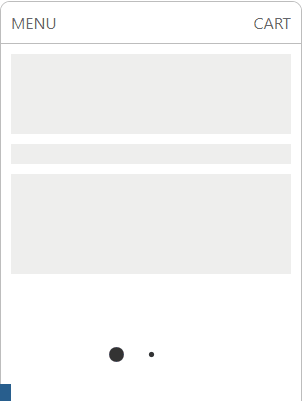
It means your header is shifting its height during load. The problem here is the logo image changing the header height once it’s been downloaded.
Let’s try to fix this.
Important: always perform changes on a duplicate of the theme.
We will set a width and height property to give the browser an early idea of the dimensions of the image to load.
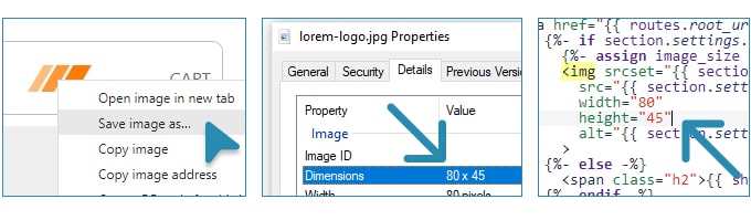
Right click on the logo
Click “Save image as…”
Save the image and open its properties on your PC
Write down its width and height
Open the theme’s code editor on Shopify
Open the header file (usually header.liquid)
Find the logo image element (it depends on the theme, you can search for “
<img“)Set the width and height to the element and save
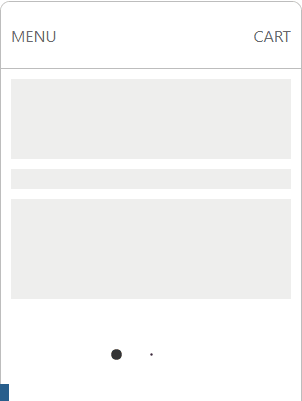
Now, try to refresh the page, the layout shift of the header might be gone.
The final result should look like this:
If this didn’t work, your theme’s image element might be a bit more complicated. Keep reading for a different solution.
2. Improve product page slider CLS
If you experience a high CLS on your product page, and you’ve solved any header CLS issue, then the product image slider might be causing it.
Let’s see what this looks like (use Network throttling again):
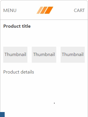
Here, the slider’s main image is loaded and displayed, shifting the other elements down. This causes a very large CLS.
To fix this, we will set a rule to keep a minimum height to the slider element at all times. It will be as much as the image’s width. This is because product images are usually square.
Inspect the featured image
Hover upwards on the DevTools to find the slider element containing the image (this might take a few attempts)
Change the width of the window from small to large, and note the width where the slider becomes full width (mobile)
Add this snippet to your theme’s CSS (replace
767px,selectoras needed and delete the comments):
/* max-width is the breakpoint width for mobile */
@media (max-width: 767px) {
  /* selector is the slider element's selector */
  .selector {
    /* We are also removing 60px to compensate for padding */
    min-height: calc(100vw - 60px);
  }
}
Here’s an example of what the slider element might look like:
What we did here is calculate the width of the main image, which is equal to its height. This is possible by getting the full screen width and reducing it by the left and right padding (although it may vary).
Note: if your product images have different proportions than the recommended (square), a specific height might not work in this case.
The result should look like this:
If it didn’t work, you might want to try with a different selector, or a different minimum height.
3. Improve CLS on other elements
If you still experience a high CLS, there might be some other element causing it.
Usually, setting the Network throttling to “Slow 3G” allows you to figure out what happens.
Another solution is to use an online tool that detects CLS and shows you where it comes from.
Finally, you can use the Rendering or Profile tab of the DevTools to pinpoint the HTML elements and the amount of CLS they caused.
Once you find out what the problem is, there are a few options.
If it’s because of an image loading, use correct width and height properties (or configure any libraries e.g. lazy loading)
Use the
min-heighttrick (being careful with breakpoints)If it’s because of text, try to change your font display.
4. Improve LCP by preloading the hero image
Most Shopify stores I’ve seen have an LCP that is about twice as long as the FCP in seconds.
This means that the biggest element on the page takes much longer than the first visible element to load. And this makes sense, because it’s usually an image that needs to be downloaded first.
Take a look at how long it takes for the main image to start loading here (let alone finish loading):
To solve this issue, we have a few weapons in our arsenal.
One thing to attempt is to “preload” the main image of the page. This instructs browsers to start downloading the image much earlier than normal, so that it’s ready when the rest of the page loads.
Let’s try that on the home page.
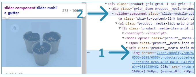
In the following steps, we will figure out the URL of the main hero image (or slide), and add the code to preload the image.
Visit the home page
Open the DevTools
Reduce the width of the window to about 500px
Reload the page
Once loaded, right click on the main hero image, and click “Open image in new tab”
Write down the URL you see on the address bar
Go back to the home page
Repeat steps 3 to 6 with different screen widths (e.g. 450px, 400px, 350px, 320px)
Confirm the image URLs are all exactly the same, so we can preload the right image for all sizes
Open the theme.liquid file on the code editor
Add this line right after the
<head>tag, replacing [URL] with the URL you found, and save:
<head>
  {% if template.name == "index" %}
    <link rel="preload" as="image" media="(min-width: 320px) and (max-width: 500px)" href="[URL]" />
  {% endif %}
The image is preloaded only on the specific page. In this case the template is “index”.
To confirm everything went well:
Visit the page and wait for it to load
Go to the Network tab on the DevTools
Click on “Img” to see images that will be loaded
Click the clear button to clear any entries
Refresh the page
Wait for the list to stop having new images come in
The very first URL, should be the one we just preloaded
Make sure the same file name isn’t found elsewhere on the list (means a different size loads after all)
Note: if you see different sizes of the image loaded as files, and you’re familiar with Liquid, take a look at the theme’s Liquid file of the section. It might help you determine how breakpoints are used to load different image sizes.
If everything went well, your image should be one of the first files to load.
Here’s how the sequence of loaded assets has changed:
Notice that the image immediately starts loading from second zero (even before the logo):
Important: this solution will apply to one main image. If you change it, you have to change the href of the link again, or code the theme so that the image URL variable is accessible in theme.liquid.
Also important: There’s something else that you might have to take into account. On mobile devices, even if the screen width is less than 500px, an image twice as big as that might load. You can learn more about this here. In that case, you need to use a mobile device and check that the URL of the image is the one we’ve picked. This might involve visiting the page, long pressing on the image, and downloading it.
5. Improve LCP by preloading the product image
The same way we can preload a static image, we can preload the product’s featured image.
Since it varies per product page, we have to use some Liquid to determine what its URL will be.
The hard part is to determine the Liquid code that gives us the proper URL. The proper URL is determined by responsive image attributes.
Here’s an example of Dawn’s Liquid that specifies image sizes:
<img
      srcset="{% if media.preview_image.width >= 288 %}{{ media.preview_image | img_url: '288x' }} 288w,{% endif %}
        {% if media.preview_image.width >= 576 %}{{ media.preview_image | img_url: '576x' }} 576w,{% endif %}
        {% if media.preview_image.width >= 750 %}{{ media.preview_image | img_url: '750x' }} 750w,{% endif %}
        {% if media.preview_image.width >= 1100 %}{{ media.preview_image | img_url: '1100x' }} 1100w,{% endif %}
        {% if media.preview_image.width >= 1500 %}{{ media.preview_image | img_url: '1500x' }} 1500w,{% endif %}
        {{ media.preview_image | img_url: 'master' }} {{ media.preview_image.width }}w"
      src="{{ media | img_url: '1500x' }}"
      sizes="(min-width: {{ settings.page_width }}px) {{ settings.page_width | minus: 100 | times: 0.64 | round }}px, (min-width: 750px) calc((100vw - 11.5rem) / 2), calc(100vw - 4rem)"
      loading="lazy"
      width="576"
      height="{{ 576 | divided_by: media.preview_image.aspect_ratio | ceil }}"
      alt="{{ media.preview_image.alt | escape }}"
    >
It’s a bit complicated but here’s what this means:
If the screen width is less than 750px, the image width will be the screen width minus some padding (4rem). The browser then has to determine which of the URLs described in srcset is the one to load, based on that width.
However, responsive images use extra factors to determine which URL to load. So the best way to tell is if I follow the process we’ve seen on the previous step. Try different widths, looking at which URLs are loading. You can use the Network tab for this.
In my case, I see that for widths less than 500px, the URL ends at “…576x.jpg”.
From the above code, it seems that the theme uses this property: {{ media.preview_image | img_url: '576x' }}.
So I can add something like this on theme.liquid, after the <head> opening tag:
<head>
  {% if template.name == "product" %}
  {% assign main_image = product.featured_image %}
    <link rel="preload" as="image" media="(min-width: 320px) and (max-width: 500px)" href="{{ main_image | img_url: '576x' }}" />
  {% endif %}
Then I’ll test with the method we’ve seen, and make sure only one size of the image loads. As in the previous step, I’ll need to also check the image file on an actual mobile device.
6. Improve LCP by removing lazy loading
Lazy loading is a method that loads images once the user scrolls down to them. So it doesn’t load all of them as soon as you visit the page. On Shopify stores, it’s implemented with JavaScript.
But sometimes, this leads to a problem. It might prevent important, above-the-fold, LCP images from loading immediately.
This doesn’t always happen. Proper implementations prevent this. But since not all implementations are perfect, we have to make sure the LCP isn’t delayed by lazy loading.
Here, I have two images. Image 1 has lazy loading enabled. I used the Lazysizes library for this, which is very often found on Shopify themes. Image 2 is loaded normally.
As you see, lazy loading causes the first image to appear later than it could.
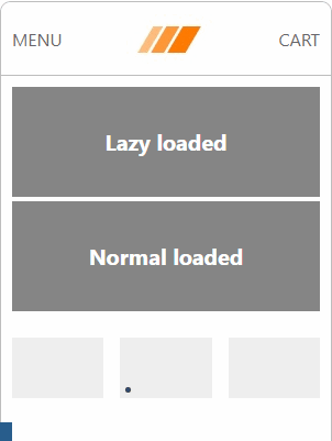
(The two images are different files.)
To fix this, we need to remove the property that tells the lazy load script to lazy load the image.
Inspect the image to figure out its selectors, parent section etc., anything to help determining the theme file
Open the Liquid file that includes the image (e.g. product-media.liquid, product.liquid, slideshow.liquid)
Locate the correct image element by searching for “img”
If its
classincludes something like “lazy”, “lazyload” etc., delete thatIf its
src,srcset,sizesproperties have thedata-prefix, remove the prefixIf it has a
loading="lazy"attribute, remove itSave the file
Back on the browser, refresh the page and make sure nothing broke
Note: This might take some effort to get it right. Liquid implementation is different on every theme. Here’s an example of a snippet before and after:
<!-- Before -->
<img
  class="feature-row__image lazyload"
  data-src="{{ media | img_url: '1x1'}}"
  data-widths="[540, 1728, 2048]"
  data-aspectratio="{{ media.preview_image.aspect_ratio }}"
  data-sizes="auto"
  loading="lazy"
>

<!-- After -->
<img
  class="feature-row__image "
  src="{{ media | img_url: 'master' }}"
  srcset="{{ media | img_url: '540x' }} 540w,
          {{ media | img_url: '1728x' }} 1728w,
          {{ media | img_url: '2048x' }} 2048w"
  sizes="(max-width: 540px) 540px,
         (max-width: 1728px) 1728px,
         2048px"
>
As you may see, this process might get very difficult if you’re not familiar with the way themes and libraries work.
Also, you want to get it right on image sliders. You want to apply this on the first image only, which further complicates things. Here’s how this would work:
<!-- We are inside a 'for' loop for each image -->
{% if forloop.index == 1 %}
src="..."
{% else %}
data-src="..."
{% endif %}
In any case, on this example I’ve removed the lazy loading from the first image:
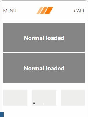
The first image loads as fast as the second, if not faster. This shows that we’ve successfully decreased the time for the LCP.
7. Improve LCP by loading proper responsive images
As we’ve seen, themes usually have responsive image attributes to load smaller images on mobile devices.
But this isn’t always the case. Some themes skip that part. I see this happen on hero / slider images and sometimes logos.
That’s why we need to make sure our LCP images are responsive.
First, let’s see how we determine if this is a problem on your site. Try this on the home page, the product page, and maybe the collection page. Also, some images are not the largest paint. But if it’s above-the-fold (directly visible when it’s visited on a mobile), its loading time contributes to the Speed Index.
Visit the page and inspect an above-the-fold image
On the DevTools, on the
imgelement, make sure you see at least ansrcsetattribute (ordata-srcset)Reduce the window width to 500px
Hover over the image element on DevTools, and see if there’s an intrinsic size property, keeping note of it
If you didn’t find an srcset attribute, and you only found an src attribute, it probably means there is one image size for all devices. And it is the “intrinsic size”, or if you didn’t find one, the “rendered size”.
If the intrinsic size is more than two times the rendered size, that’s not optimal.
Since we don’t want a 1920px wide image on a 360px wide device, we have to give the browser smaller sizes to work with.
We simply need to add responsive attributes. When we see the data- prefix before the src, the theme is likely using a lazy loading library, so we have to follow their documentation.
Otherwise, here’s what to do:
On the page, inspect the image
Note its selectors and the selectors of its parents (e.g.
class)Open the theme editor
Based on step 2, find the file that includes the image (e.g. header.liquid, slider.liquid, product-media.liquid)
Add
srcset(maybe alsosizes) attributes to the image element and save, for example:
<!-- Before -->
<img src="{{ media | img_url }}" width="500" height="500"/>

<!-- After -->
<img srcset="{{ media | img_url: '500px' }} 1x,
             {{ media | img_url: '1000px' }} 2x,
             {{ media | img_url: '1500px' }} 3x"
     width="500" height="500" />
(In the above example we are using x-descriptors instead of sizes .)
Important: as you’ve guessed, the code will vary based on lots of factors. For example, placement, breakpoints, dimensions, layout, original image size, theme code.
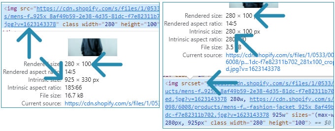
As an example, I have one image with a single width of 925px (17kb) and one responsive image with an additional size of 280px (4kB) for mobiles. This is the difference:
You might also notice that the first image is blurry, having a completely different intrinsic size compared to its render size.
8. Improve the SI by removing sliders
The faster your above-the-fold content finishes loading, the better the Speed Index.
Above-the-fold sliders / carousels / slideshows require JavaScript. The script takes the images you’ve added, and builds an interactive component, with animation, thumbnails, arrows etc. This takes time.
Here’s an example where I’m using the Slick slider, common in Shopify themes:
Notice how long it takes for the slider to be ready, and the little white dots to appear on the first image.
Also notice how much earlier the second image has loaded and settled.
The solution to this is simple. Replace the slider with a single image. Chances are your users aren’t looking at every slide.
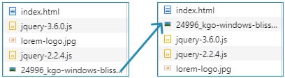
9. Improve FCP, LCP, SI, TTI, TBT by removing uninstalled app code
Shopify apps are supposed to automatically remove their code from your theme once you uninstall them.
Unfortunately, this doesn’t always happen. There are so many stores that experience low performance because they still load CSS and JS of removed apps.
Every time you uninstall an app, you have to go to your theme and delete any traces. If don’t know how to do that, here’s what to do:
First, you have to know if there’s leftover code.
Then, if there is, contact the app’s support and ask them to remove the code manually from your store.
But let’s first see how you can tell if the app has left code on your theme.
Check your website, to see if there are still app widgets (e.g. you deleted a popup app and you still see the popup)
Visit the homepage and wait for it to stop loading
Open the DevTools and the Network tab
Select the “JS” type
Click the clear button
Refresh the page
Wait for the page to stop loading
See if there are files with a URL that could relate to the app (e.g. if you deleted “Random”, and you see app.rand.io/…js)
Repeat steps 4 to 8, this time selecting the “CSS” type
Repeat the above steps (2 to 9) for the product page, or any other page
Open theme.liquid on the theme’s code editor
Look for any lines that could relate to the app (e.g.
<!-- Random app code below -->{% include 'rand' %})Look at other files too, like header.liquid, footer.liquid, product.liquid, product-template.liquid etc.
The above steps should cover most cases where an app has left the code on your theme, after you uninstall it.
Then, contact their support, or delete the Liquid code yourself. If you’re not sure of what you’re doing, be careful because you could break something on your site.
If you managed to remove unneeded assets, you might experience a large difference on Performance Score.
How to improve the Shopify Speed Score – 9 more tips
10. Remove theme features you don’t need
Go to your theme customizer and click on Theme settings. There might be features you don’t need. Free and paid Shopify themes have plenty. For example, if your theme has a loading screen that covers the whole page, it’s probably doing more harm than good, so you can disable it.
Also check major templates like Product. Click on the sections and their blocks to open their settings. Then, remove unneeded features. For example, you might have a reviews app you like, but the theme might also offer that feature. You can decide which one to keep, but don’t keep both of them.
11. Compress images
Compress your images, especially the ones above the fold. Visit this guide for info and instructions on how to do that.
12. Replace PNG with JPG images
If you have PNG files but you don’t need their background to be transparent, replace them with JPG.
Find out what their format is by visiting your product pages in the admin dashboard and opening the Media, and by going to the Settings > Files page.
13. Lazy load below-the-fold images
We want to remove lazy loading from above-the-fold images, but we need it for the rest.
Figure out if your theme includes a lazy loading library by looking at its JavaScript files. If it is, configure the Liquid of your images to use it, in case they don’t use it already. Otherwise, integrate a library like Lazysizes.
14. Don’t add non-responsive, non-lazy-loaded images in Custom HTML sections
Many times you’ll need to add some HTML to your theme, using a custom HTML (or Liquid) section.
An example of this is three icons or images with features of your products.
When including img elements, consider using lazy loading and responsive attributes.
15. Defer unnecessary app scripts
Apps sometimes add scripts to the theme.
When we saw how image preloading works, we also saw how these scripts delay the LCP, if they are in the head of the page. In fact, they also delay the FCP.
From those, some scripts load an external file (src="..."). The browser has to download it, execute it, and then continue reading the rest of the page.
This might be necessary in cases like analytics scripts. Because if they don’t load soon, they might miss a user’s action until they have loaded. This means inaccurate reports.
Another example is jQuery, because lots of themes rely on it to do everything. So it has to load first.
However, there are scripts that are not required to run right away. One example is a chat app’s script. It can always wait until everything has loaded first, to show the icon. And most apps already know whether they have to load immediately or not.
But it doesn’t hurt to see if an app is blocking page load for no reason. In some cases, there’s room for improvement.
For this, we can instruct browsers to delay loading and execution of the script until after the page has loaded.
Here’s what to do:
Open theme.liquid and on the theme editor
Find the area between the
<head>and</head>tagsTry to locate app code, like we did when we wanted to remove uninstalled app assets
Also follow any imports that look like
{% include 'an_app' %}by clicking on the arrow when you hover over themIf you find a line like
<script src='...'></script>, and it has noasync='defer'attribute, keep note of it
When you have a list of possible scripts, time to figure out if we can defer them.
Based on reason, think if the app’s functionality shouldn’t be delayed (e.g. analytics, jQuery, theme.js, lazyloading)
If you think it can, add the defer attribute to it and save
Visit your site and test in case something broke
Here’s an example:
<!-- Before -->
<script src="{{ 'an-app.js' | asset_url }}"></script>

<!-- After -->
<script src="{{ 'an-app.js' | asset_url }}" async="defer"></script>
Note: You can always contact the developer of an app and ask them about the steps they are taking to optimize their app’s theme code.
16. Install a faster theme
In some cases, you can consider a more optimized theme than the one you have.
You can do this if you haven’t invested too much in customizing the current theme, if building your pages in another theme is not very difficult, and if you find out your theme is responsible for a low Shopify speed score.
Here’s one way to find out how your theme compares to other options
Download fresh versions of them from the Themes page on your dashboard
On the fresh version of your current theme, select Actions > Preview
Open the Chrome DevTools on the new page, and select the Lighthouse tab
Audit for performance on mobile, 2-3 times for more accurate results
Repeat steps 2 to 4 for the fresh candidate theme
Compare the results between the two options
17. Replace apps with custom code
Apps are very useful. You simply click on a few buttons and you have new functionality on your store, right away.
But what if you only need a simple feature? And you don’t care about customizing every detail of it all the time? Then it might be a good idea to replace the app with some custom code.
For example, you might want a theme section. Consider implementing it with custom code, instead of installing an app. Apps usually cover a variety of use cases, while yours might be much simpler.
18. Replace slow apps with optimized apps
Most apps on the Shopify app store have a free trial. Try out different apps separately, run a PSI or Lighthouse (from DevTools) audit on the store. Don’t forget to look at the theme’s code in case they leave traces when you remove them.
Other tools to measure speed
As we’ve seen, the Shopify speed score comes from Lighthouse. Google offers PageSpeed Insights, an online tool that also uses Lighthouse, plus performance data Google has gathered from real usage on the Internet.
Another popular tool is GTmetrix. Some argue that it’s better at describing how fast a store is.
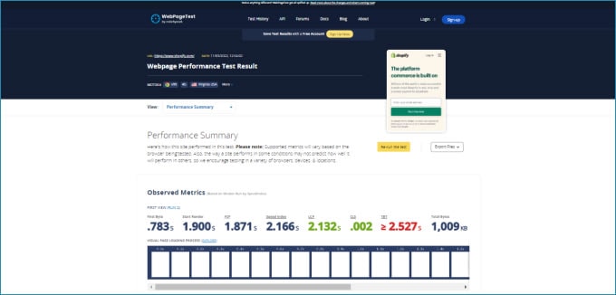
Also, you can find out a lot of other details about how your website loads, from WebPageTest.
Conclusion
These are a number of optimizations to improve your speed score and user experience. Some of these take hours to implement, some take only a few minutes.
For a store to achieve its maximum speed score, keeping a clean theme codebase with minimal usage of apps, constantly keeping track of performance by auditing your pages, and looking into details like asset loading and JavaScript profiling, is necessary.
Thanks for reading! If you have any questions, don’t hesitate to leave a message below.